

la glace
As much as I consider myself a lover of all things minimalist I cannot deny a love for romantic, art nouveau inspired designs.
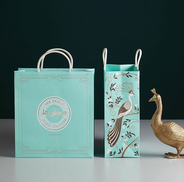
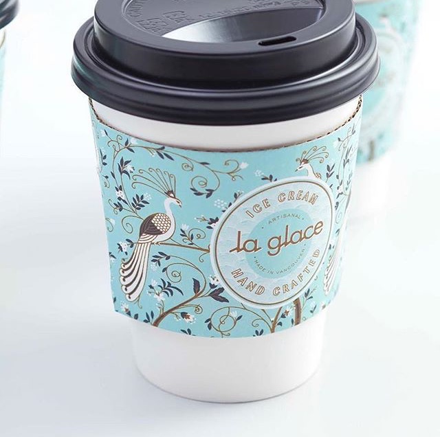
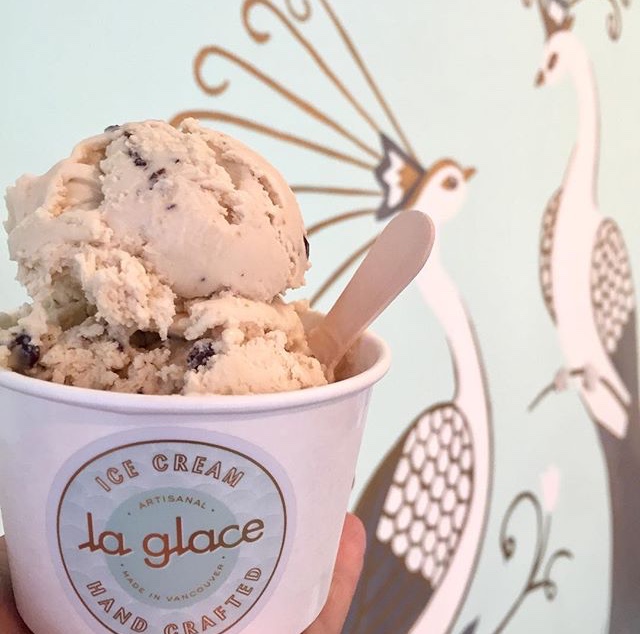
So needless to say the gorgeous designs for Vancouver based la glace ice cream had me swooning! The combination of the mint and gold with the vintage garden and peacock imagery creates such a elegant and decadent presence completely in line with the French style identity of la glace.
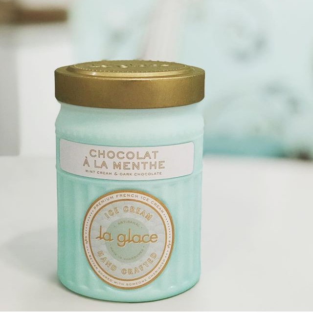
I especially love the custom milk glass jars used for take home treats. The beautiful jars encourage customers to keep them long after the ice cream is gone and find alternative uses for them. I know I would have a line on my window sill in no time!
The branding and identity for la glace is a perfect example that modern branding need not always consist of black, sans-serif typefaces on white backgrounds to be contemporary and visually stunning.
All images courtesy of the la glace Instagram account.
The studio responsible for the gorgeous la glace branding and identity designs, arithmetic.


